I’m not a UX expert, but I have opinions.
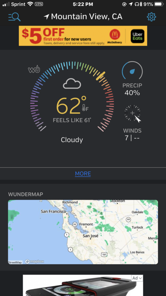
Weather Underground is one of my most-used apps. It gathers data from thousands of neighborhood weather stations run by individuals. Here’s the new front page:

The first thing you might notice is the large circular dial. That’s taking up a LOT of real estate here, and it doesn’t add a lot given that the temperature is already listed. (It took me a bit to realize this was temp, and not a compass direction). The app used to show relative weather (“Today will be cooler than yesterday”) which I really miss. Likewise with hourly specifics, like (‘Rain will begin around 2:00’) rather than just a percentage spread out over some unspecified amount of time. I just want to know if I need to grab an umbrella or not, and so on.
And what’s going on with the little wind dial? Is it pointing northwest or southeast? And I have no idea what that — underneath “Winds” is supposed to show.
The Wundermap is nice, but I wish I had more control over what appears above the fold…
Let’s scroll past the huge tracts of ads. (not faulting anyone for this–gotta pay the bills)

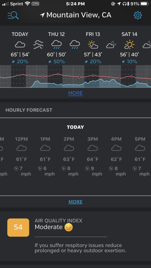
Are my eyes playing a trick on me, or are the “daylight” sections of this top readout darker than the nighttime ones? Nights are the dark times, right?
The other thing that keeps tripping me up on this page is that there is no indication of where “now” is. It looks like it will start raining in the evening, but I can’t get a sense of how imminent that might be.
The red line looks like temperature, but what those unevenly-spaced hollow dots represent, I haven’t the slightest idea.
The hourly section came up exactly like this on a fresh launch of the app. Admittedly, forecasting the past is easier, but still I with it was scrolled to the point where I could see what’s upcoming. Maybe some indication of “now” here would also help orient viewers, and link the hourly forecast to the daily one above.
Anyway, the devs are always tweaking things, so I hope they’ll run across this and take it into account in their designs.
Signed, a fan -m