There are a bunch of complete build logs available for the Dactyl Manuform and similar mechanical keyboards, so I wanted to focus on the specific design choices I made and why. Huge hat-tip to Zack Freedman, in particular with this video, which served as inspiration that I could pull this off.

Why a mechanical keyboard? I grew up on those old IBM Model M keyboards that weighed 600 pounds and were super clicky. These days I’m looking for something particularly ergonomic, since my wrists are not as young as they used to be and I’m in front of a keyboard the majority of work hours as well as after hours. Of commercial ergonomic keyboards, I’m doing respectably well with a split Kinesis Freestyle2, and the Kinesis Advantage2 looks like it would work great to avoid carpal-tunnel-type discomfort–if only the think wasn’t so huge it would take up half my desk. So to get exactly what I wanted, I’d need to build it myself.
My design philosophy is that I’m making a 20-year keyboard. I will own and use this thing well into my retirement, and some day pass it down to my children. This guided my choices in materials and the craft I put into it.
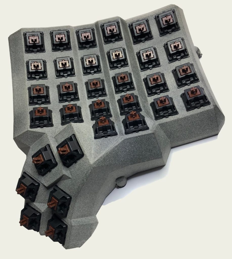
Enclosure philosophy: I could have printed the enclosure myself in PLA or PET, but in my estimation that wouldn’t make for a 20-year keyboard. I’m OK with the case looking used and worn, but not cheap or fragile. For the main enclosure I sent out to have it printed in MJF nylon. The Multi-Jet Fusion process begins with a bed full of nylon powder, and what’s basically an inkjet print head sprays layers of fixative to gradually produce a 3D object. No supports needed. Even though the nylon is pure black, it comes out looking gray due to the powder texture. I considered sanding and painting, but I like the look of the raw nylon, including the gradually developing patina. Since it’s no good to have a lightweight keeb sliding all around the desk–I wanted some heft. I had the baseplates laser cut from 12ga 304 stainless steel. It looks great and serves its purpose perfectly. The enclosure files were set up for M3 screws, but the cutout for threaded heat inserts was too small for the M3 ones. I went up a notch and kind of melty-brute-forced M4 inserts in there, and drilled bigger holes through the stainless with a HSS cobalt bit.

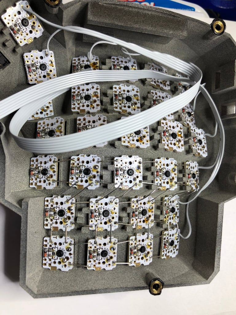
Keyswitch philosophy: Cherry MX brown. Moderately tactile, but not clicky. This was my favorite from the sampler pack I bought. As much as I’d like to go full decibel, I do occasionally need to type in meetings, and the keyboard can’t be too distracting. In a keyboard shaped as weird as this, it’s hard to find a PCB that works, though there are several out there experimenting with flexible boards. Instead of “hand wiring” I went with a bunch of small “Amoeba” boards, one per key. I put the resistor and diode on each one in bulk, with solder paste and a hot plate.

These handle all the tricky wire crossovers and make the internal wiring very clean. And they support LEDs.

Keycap philosophy: Nothing too fancy, though they are easy to replace if I change my mind. The ones pictured are from two different sets of basic black DSA profile caps, one with legends on the top, another on the fronts. Some temporary keys are shown in the thumb cluster, as it’s hard to find nicely-labeled 1u-width caps for Shift, Option, Return, and so on. What’s with all the builds out there using unlabeled keycaps? I have some of those too (including the clear one–that’s the space ‘bar’) but seriously, what’s the appeal? For modifier keys, it’s not the worst thing in the world if they have a different feel, like those temp keys. And two bits of sticker on the F and J keys, to help your fingers find the right place, just like the store-bought keyboards.
Backlight philosophy: Well, I truly despise RGB lighting on keyboards; It’s totally pointless and distracting. Maybe when it’s feasible to put a tiny screen on each keycap I’ll reconsider, but for the foreseeable future, there is zero utility in having addressable lighting, much less in different colors. There is utility in backlighting though–you know, being able to see the keys in the dark. So each keyswitch has a 2x3x4 white LED. One thing that bothers me even more than RGB lighting is flicker. CPU-driven LEDs as a general rule use pulse width modulation. Except at 100% brightness, they’re always turning on and off rapidly, which I seem to be extra sensitive to. Even at 60 or more FPS, any movement of my head or eyes produces a “dotted line” which is distracting. So for lighting I went full analog.
For those interested, here’s the schematic for the lighting portion. Yes, I’m using a rheostat configuration to brute force limit current. This is one of the first things newbies are warned against because it can have undesirable effects in addition to being woefully inefficient. But this ain’t a train set, it’s a bunch of LEDs, each driven in low single-digit milliamps at the brightest. This is why there are zero-ohm resistors soldered across all the Amoeba boards. All current limiting is done through one fixed resistor in series with a potentiometer. At this low of a current, the LEDs have a noticeably lower forward voltage than their data sheet (spec’d for 20ma) assumes. This can drive the LEDs at small microamp levels, which produces a nicely subtle lighting effect that pleases me. And in the worst case, there’s less than a tenth of a watt dissipated in the potentiometer, and it can handle it fine. For balance, the analog dial goes on the opposite side compared to the main USB.

Observed Vf is around 2.5 volts, leaving the other 2.5 volts to drop across the resistors. At the brightest this is 2.5 / 68 = 36mA, which gets divided 64 ways. Would a constant current source be”better”? It would be more complicated. For 36mA it’s hard to justify the added hassle adding yet another PCB. Paralleling a bunch of LEDs like this could potentially lead to different currents, and thereby different brightnesses in some of them due to manufacturing tolerances. These were all from the same batch though, and I did a preview test to put them through their paces, and it worked like a charm. I don’t notice any brightness differences at all.
Connectors and controllers. Despite the popularity of the TRS (tip/ring/sleeve) cable connecting the two parts, I opted for a telephone-style RJ9 connector. Remember those curly cables connecting telephone handsets to the wall-mounted box, Stranger Things-style? That’s my interconnect. For one thing, I needed the 4th wire for the LED dimming circuit. And it fits perfectly in the case as designed. Each half has a generic Arduino Micro running an identical build of QMK (which differentiates sides based on which one has the main USB connected).
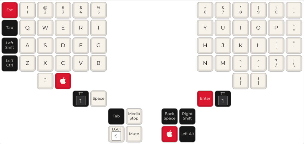
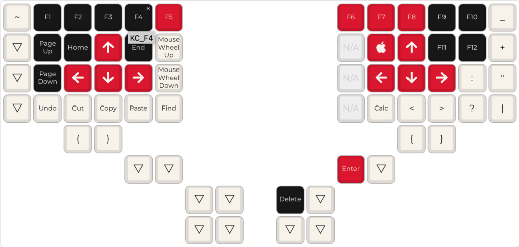
Key layout: QMK defines different “layers” in your keeb, so that when holding/toggling a certain key, the keyboard goes into a different mode. You can potentially define dozens of layers, but this makes it more complicated to keep track of all the different toggle keys. Also, it’s difficult to use toggle keys for other things.
My biggest concern here is the lack of cursor arrow keys. To make this less of a problem, there are arrow keys on both halves, symmetric Fn keys (one press to activate the layer as long as the Fn key is held; double tap to turn on the layer until deactivated). There’s also a dedicated Save key (which simply outputs Cmd+S), which fits my work style of maniacally saving every three seconds. Layout graphics (and firmware compile!) courtesy of https://config.qmk.fm/


Closing thoughts. Still getting used to it. I like that I can have full control of the firmware and layout, and will probably tweak it over time. Sadly, this is not terribly portable, so I probably won’t be bringing it into the office. Maybe I’ll build another?
Credits: Enclosure uploaded by ZackFreedman; designed by Tom Short and uploaded as permitted under the Creative Commons Attribution license. If you want to laser cut the baseplate, this model has fixed geometry, and is licensed under CC-Attribution by aylo6061, who is also active and very helpful on the VoidStarLabs Discord. Thanks! Not an affiliate link, but I had a great experience with SendCutSend to get this baseplate cut. Everyone should have a keyboard made with lasers. I had the nylon part printed by Hubs (formerly 3DHubs) which was pricey, but worth it. QMK firmware is licensed under the GPLv2 and other licenses, though for this project I did not need to modify source (other than a config file) or publicly distribute any code.
Love to hear your comments. The best place to find me is on Micahcosmos.
